

LN-Design
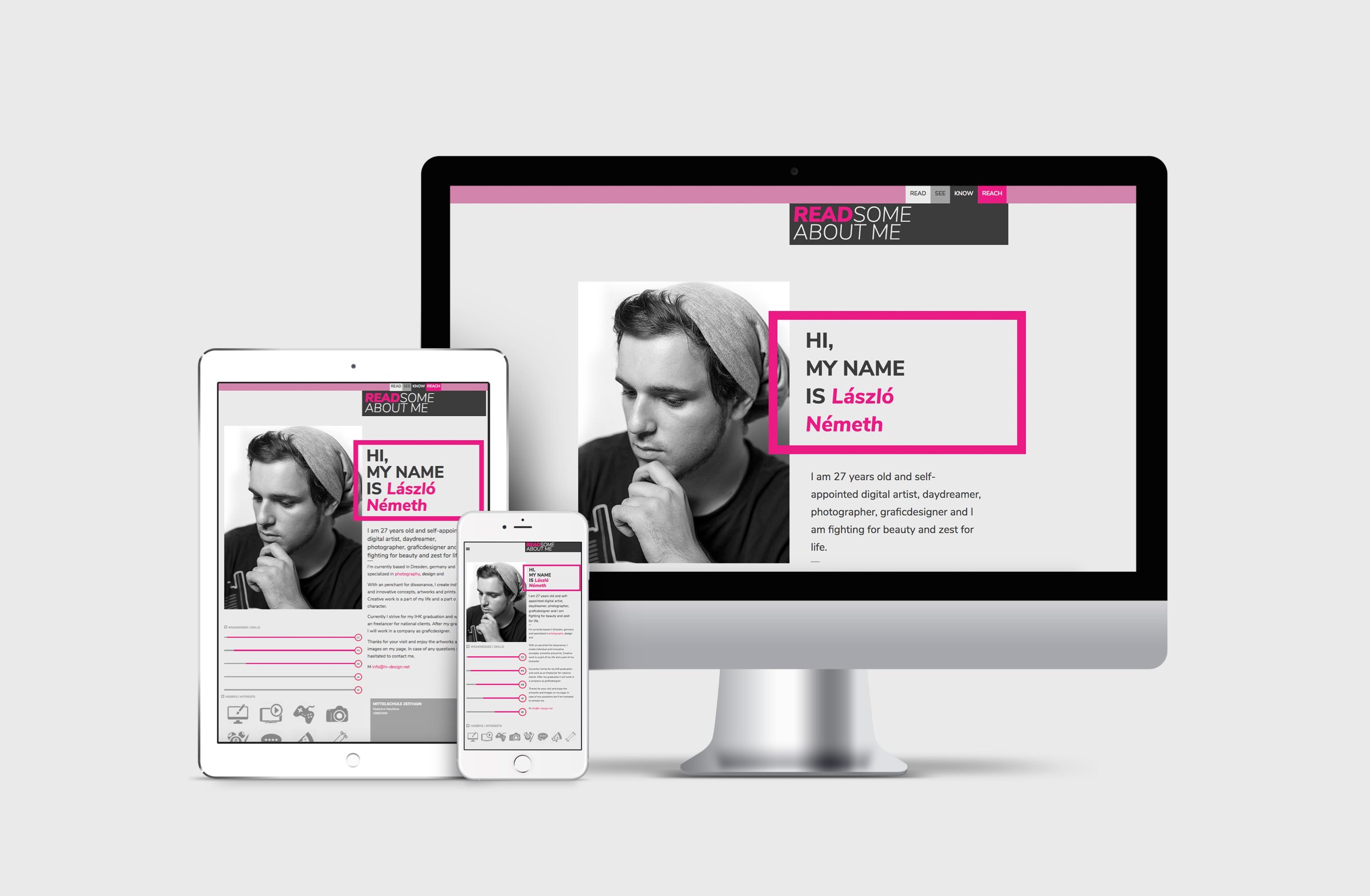
The LN Design project involved a comprehensive redesign of the company’s visual identity, focusing on updating the logo, typography, and corporate design. The logo, refined with sharp, dynamic lines and a bold color accent, symbolizes the forward-thinking and innovative approach of the agency. A modern typeface was selected to complement the new visual language, enhancing clarity and professionalism across all platforms. The redesign extended to creating business documents, a new website layout, and cohesive corporate branding, ensuring a consistent and impactful presence for LN Design across all touchpoints.
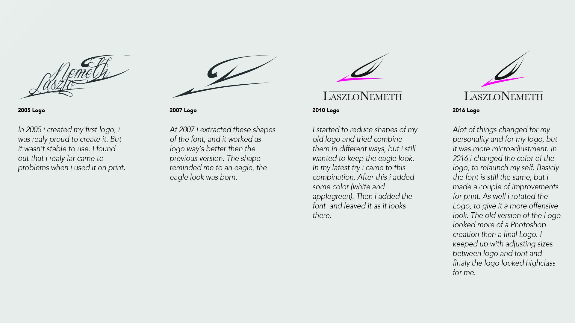
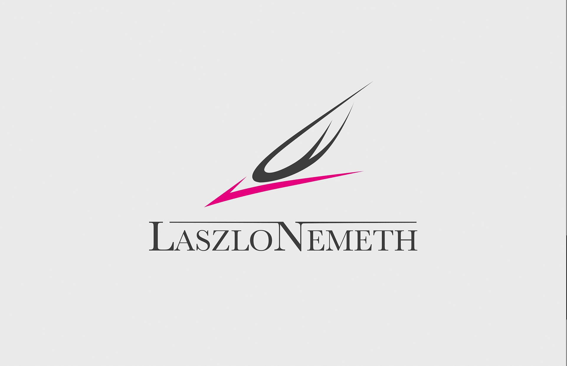
The logo for LN Design symbolizes an eagle in a powerful dive, representing the designer's bold, open, and free-spirited approach to creativity. This dynamic imagery reflects the intent to conquer and captivate through design, creating impactful and successful works that, like a dive, strike with precision and purpose. The logo embodies the vision of delivering designs that not only capture attention but also resonate deeply, achieving success and making a lasting impression.
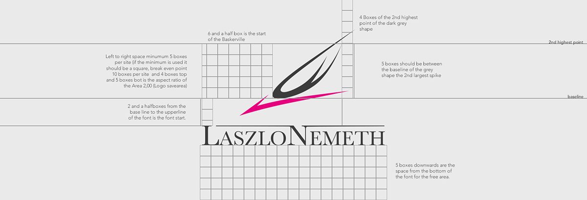
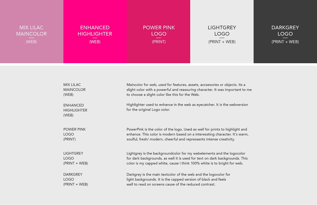
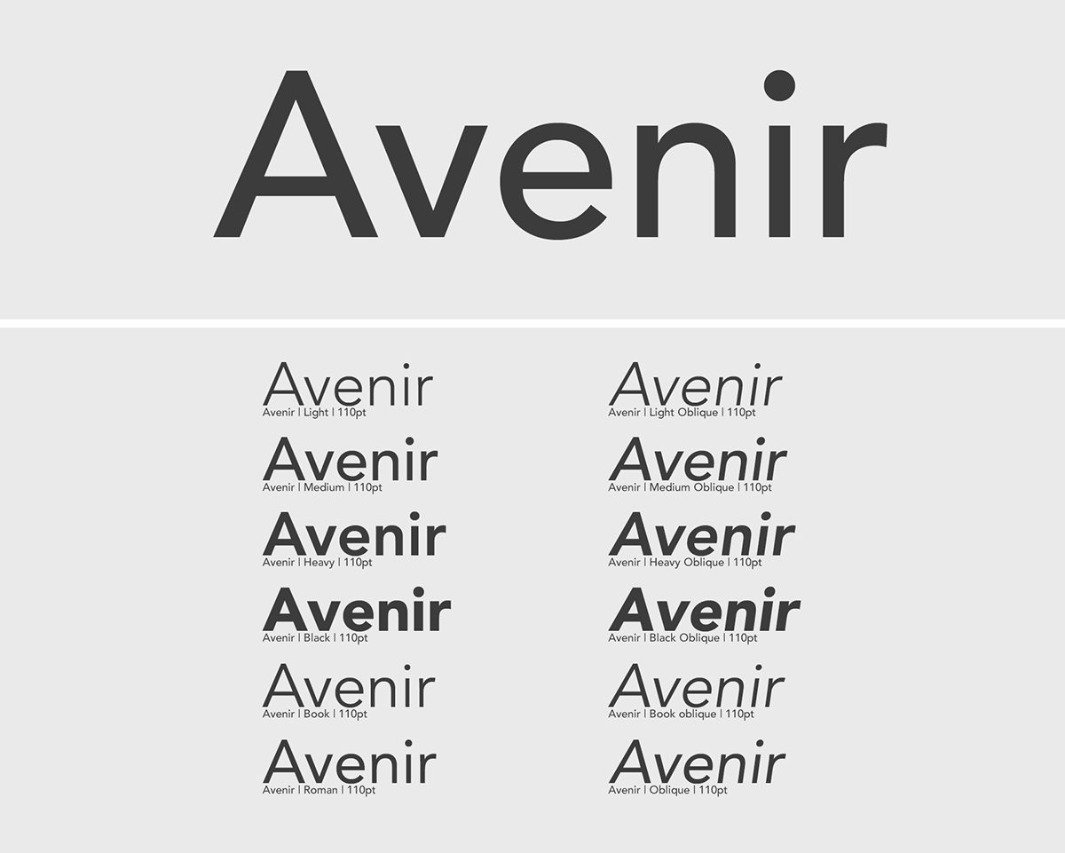
For the color palette, bold Power Pink is used in print for a striking impact, while Mix Lilac and Enhanced Highlighter are reserved for the web to add a modern, approachable feel. Light and Dark Grey ensure clarity and balance across media. The Avenir font was chosen for its modern, clean lines, offering versatility across different weights for both web and print. Safe spaces are defined by a grid system, ensuring the logo and text have room to breathe, maintaining visual clarity and impact. The consistent spacing keeps the design clean and professional.
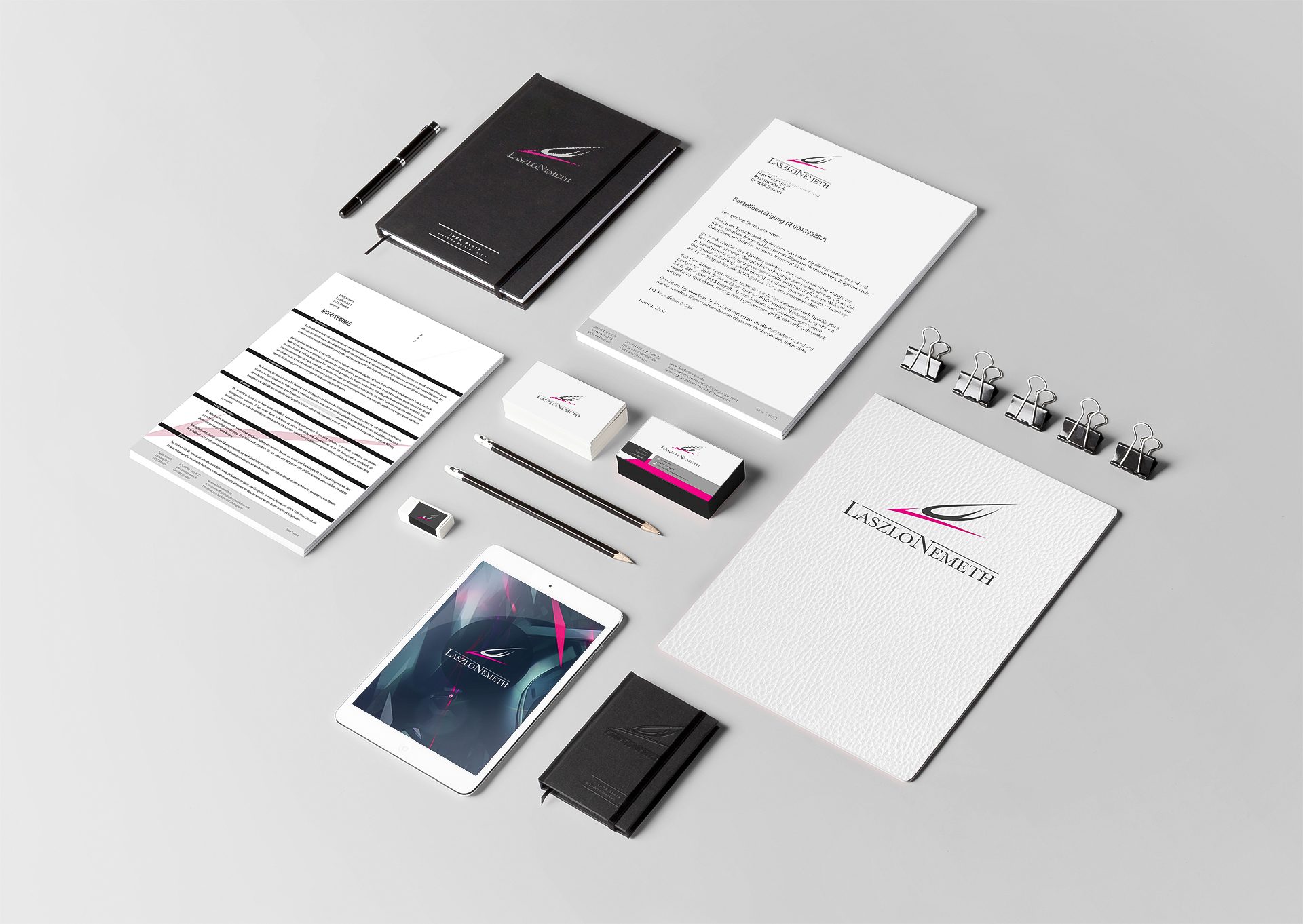
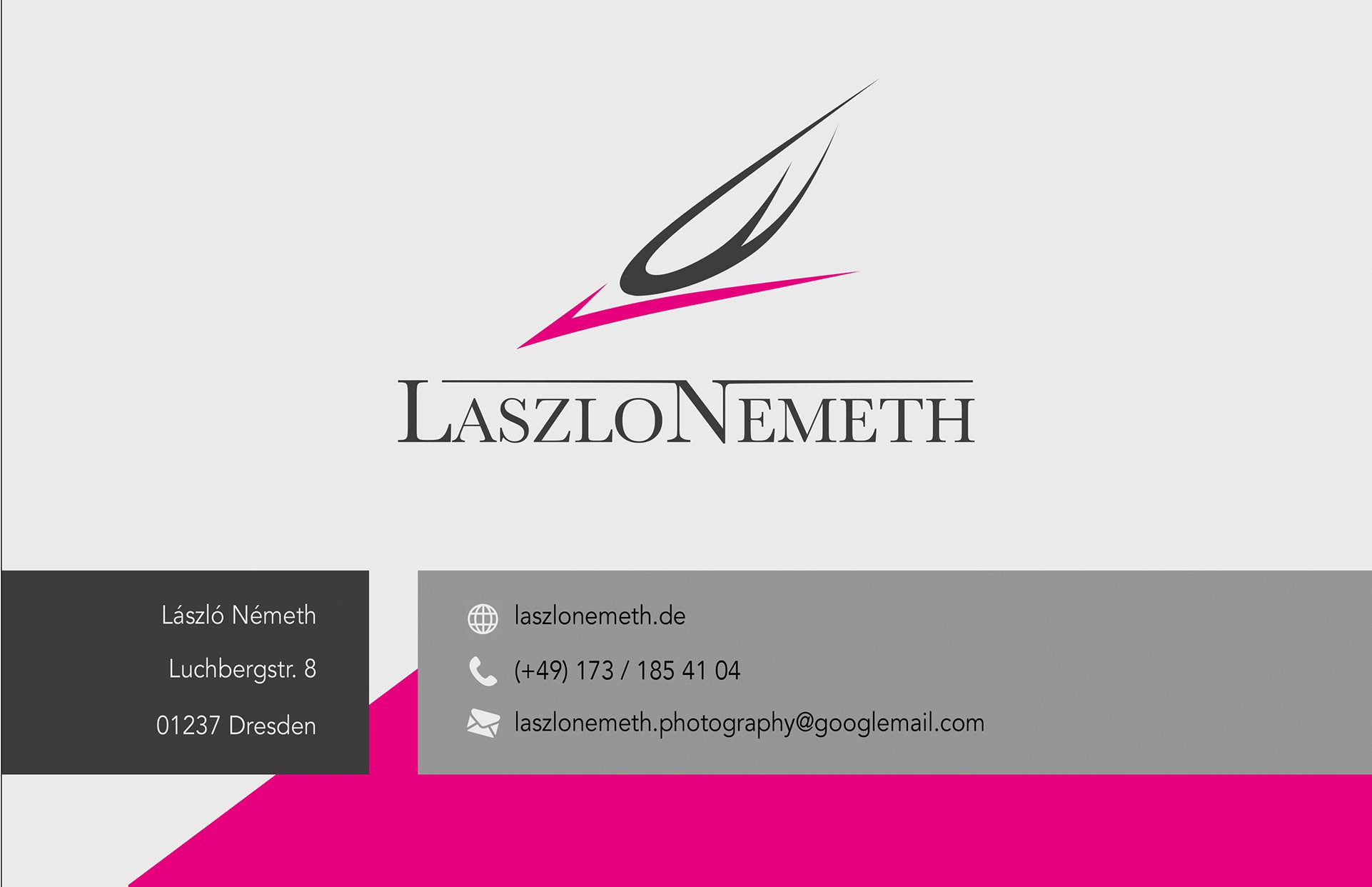
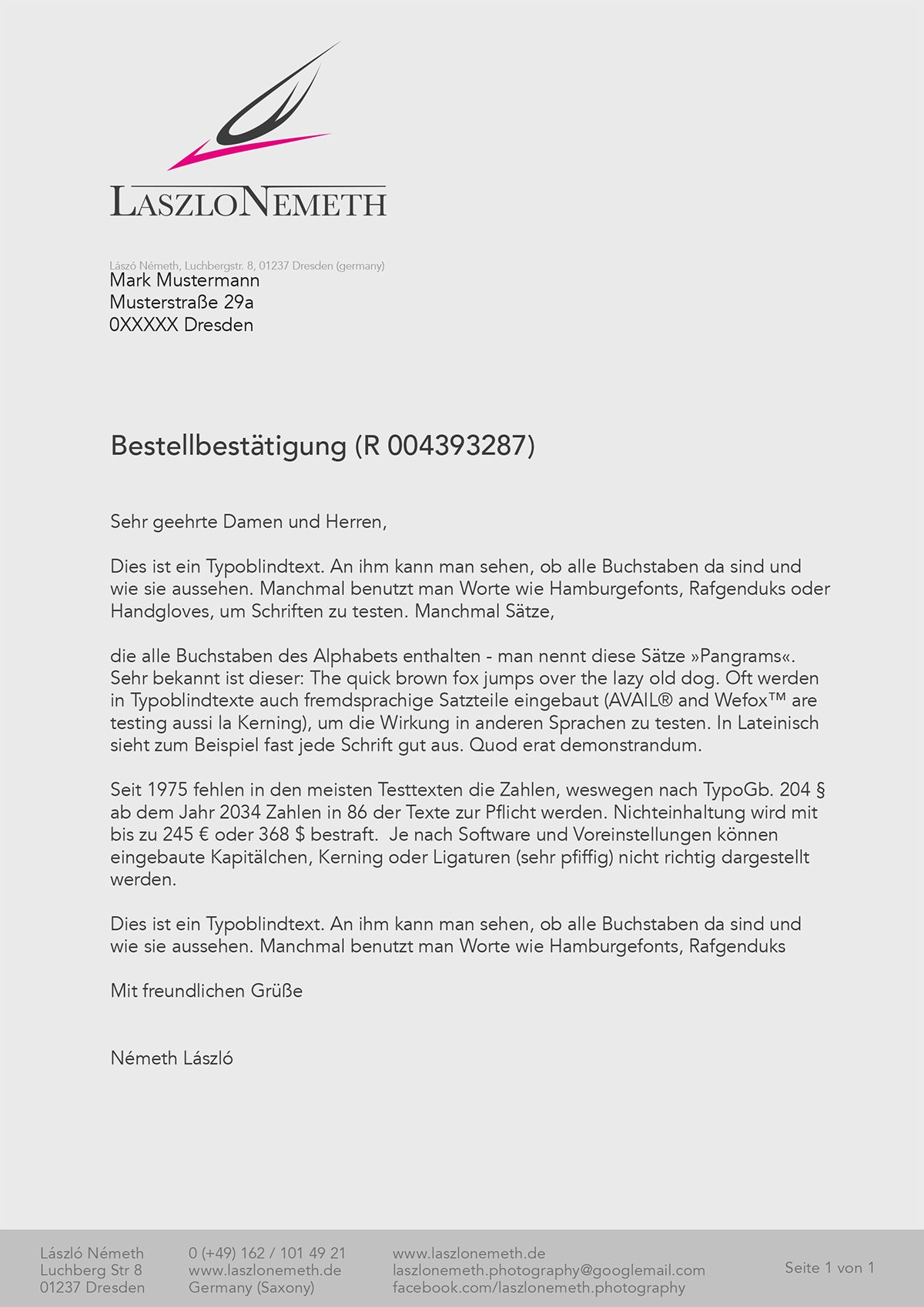
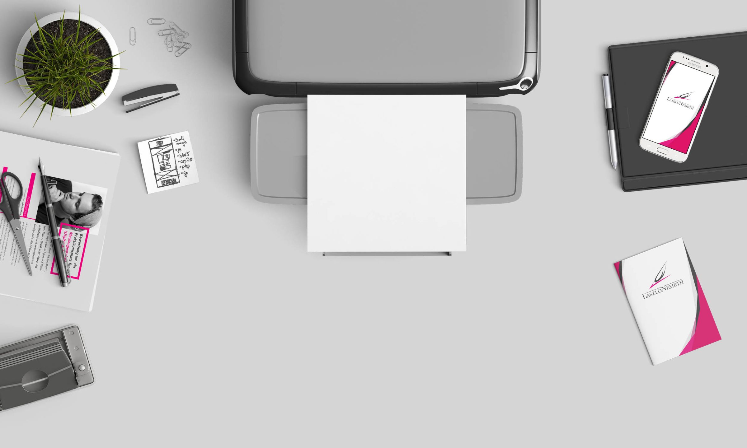
The corporate stationery for LN Design embodies a sleek and professional brand image, designed to make a strong impression. The logo, featuring an eagle in a dynamic dive, symbolizes the agency's bold and open approach to design, striving to conquer and impact through powerful visuals. Business cards and letterheads were developed with a clean, minimalist design, ensuring readability and sophistication. The typography was carefully selected for both print and digital consistency, reflecting a modern and professional tone. The overall design maintains a cohesive flow, with balanced safe spaces and a well-structured layout, emphasizing the brand’s commitment to excellence and successful communication.

The LN Design website relies on a clear, dynamic design with the Avenir typeface for modern elegance. 'Power Pink' highlights important elements and creates a strong visual focus. Generous safe spaces ensure readability and underline the minimalist concept.
More artworks on NEXETH.ART ↗