

Shadowness Magazine
In 2016, I was invited for an interview by the online magazine from Shadowness.com. As part of the project, I was responsible for designing the pages that featured the interview. This involved incorporating the magazine’s provided question list and my personal responses into a cohesive layout that represented my style. The project allowed me to creatively express both my design skills and my thoughts, reflecting on my journey as a digital artist.
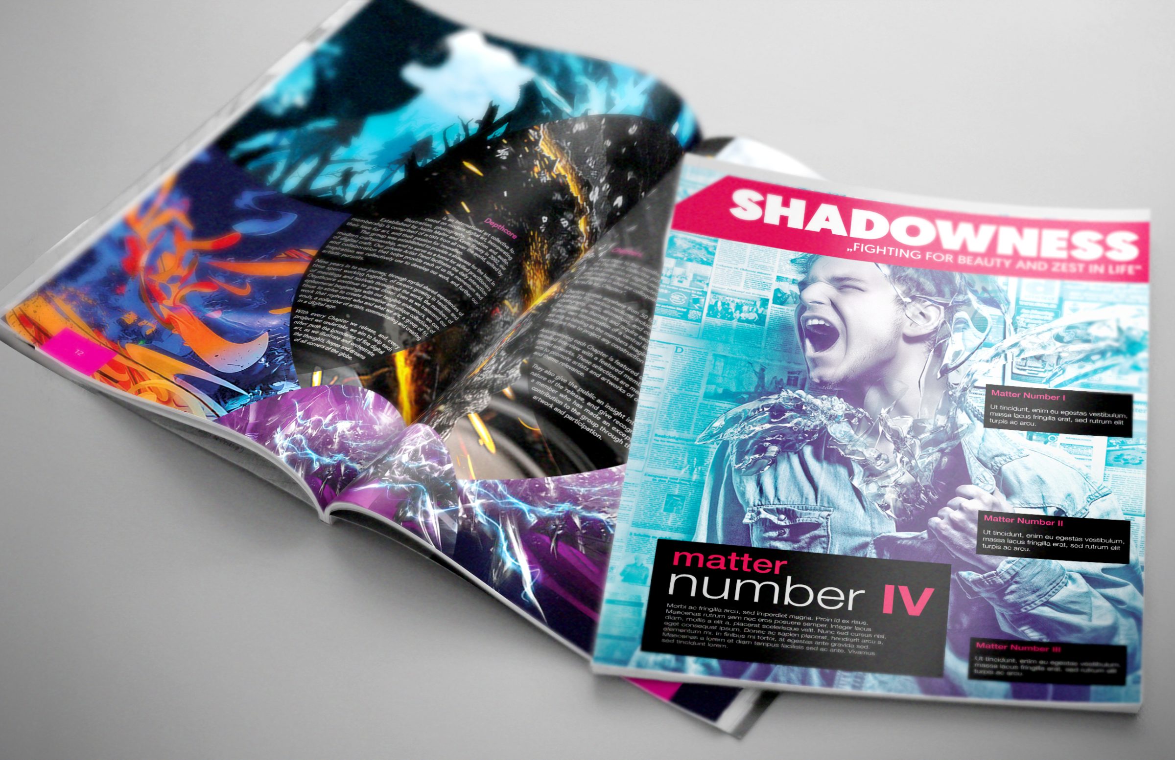
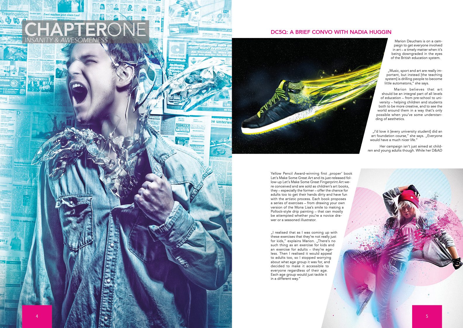
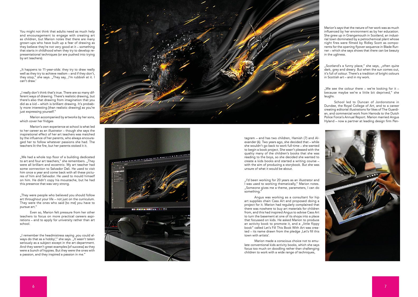
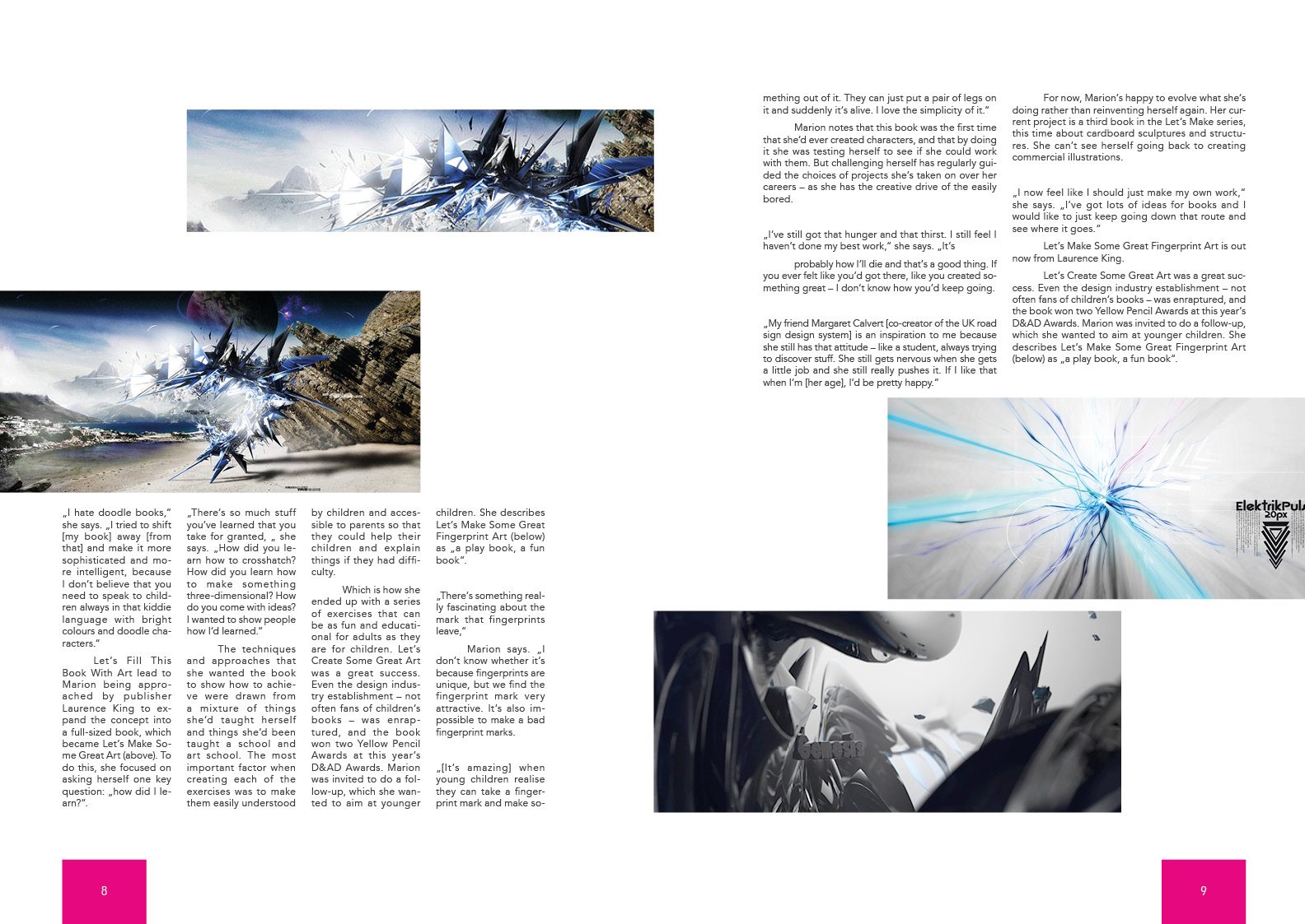
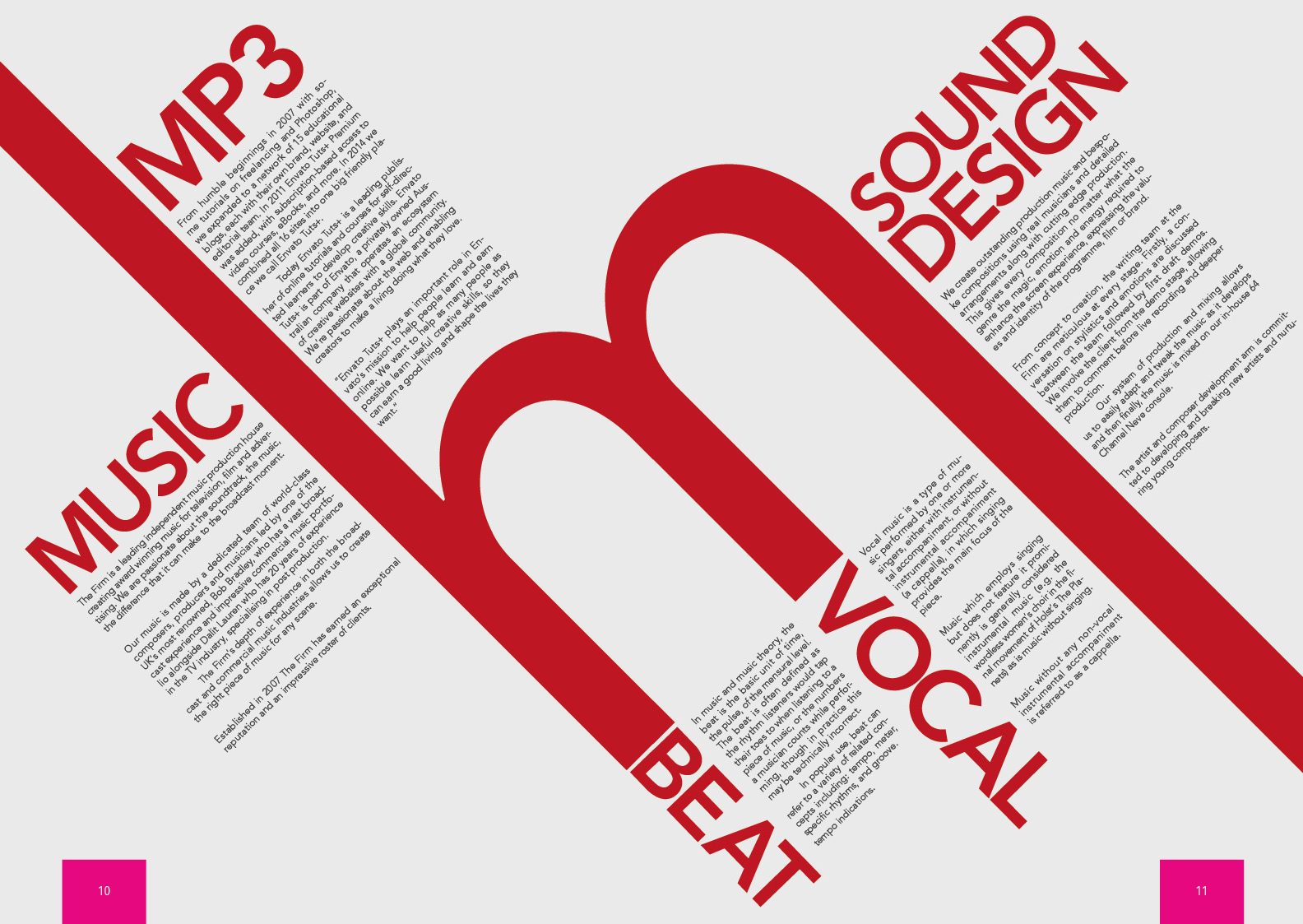
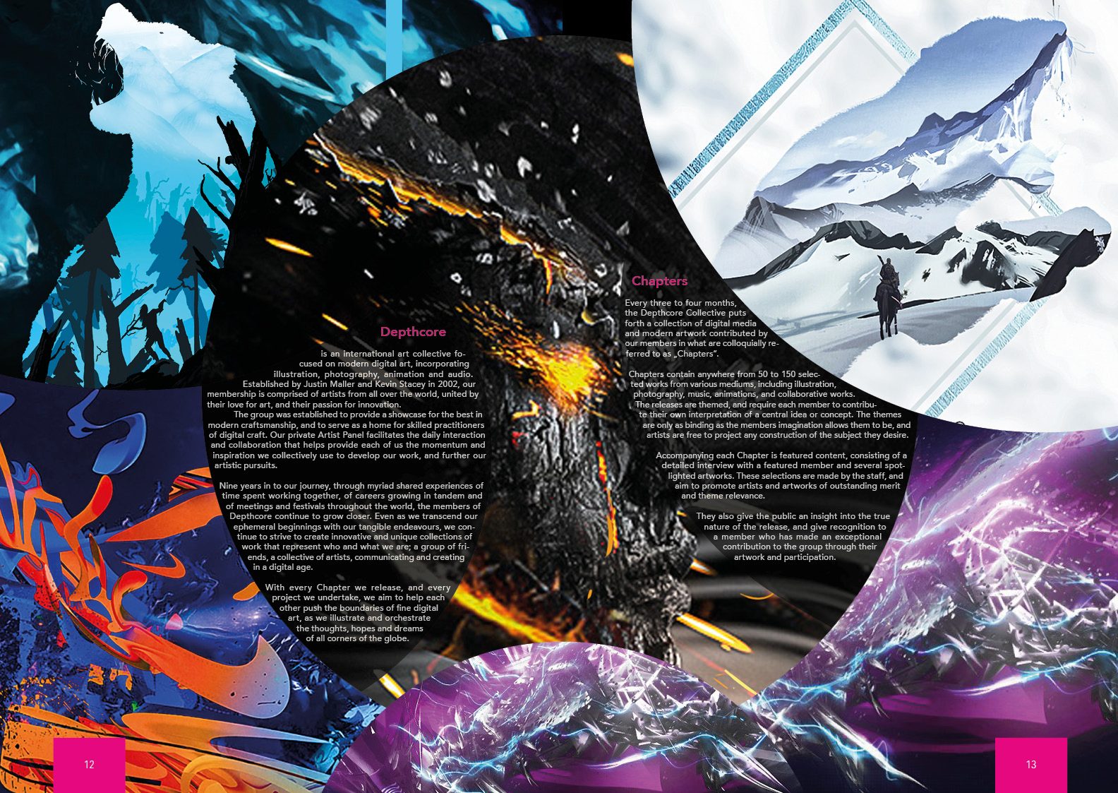
The cover design is bold and vibrant, using neon pink and electric blue to capture attention and reflect the theme of 'fighting for beauty and zest in life.' The inner pages balance dynamic visuals with clear typography, ensuring readability while maintaining a strong artistic appeal, making the design both engaging and immersive. They continue the cover's dynamic, visual style with a variety of design elements: every page is carefully designed to offer a coherent and vibrant aesthetic. Large, high-contrast lettering in creative layouts and powerful visual content dominate, with a focus on intense image compositions and plays of colour. The pages structure the content clearly and, through colour combinations and typographic devices, strike a balance between information and artistic expression.
More artworks on NEXETH.ART ↗