

Aquila
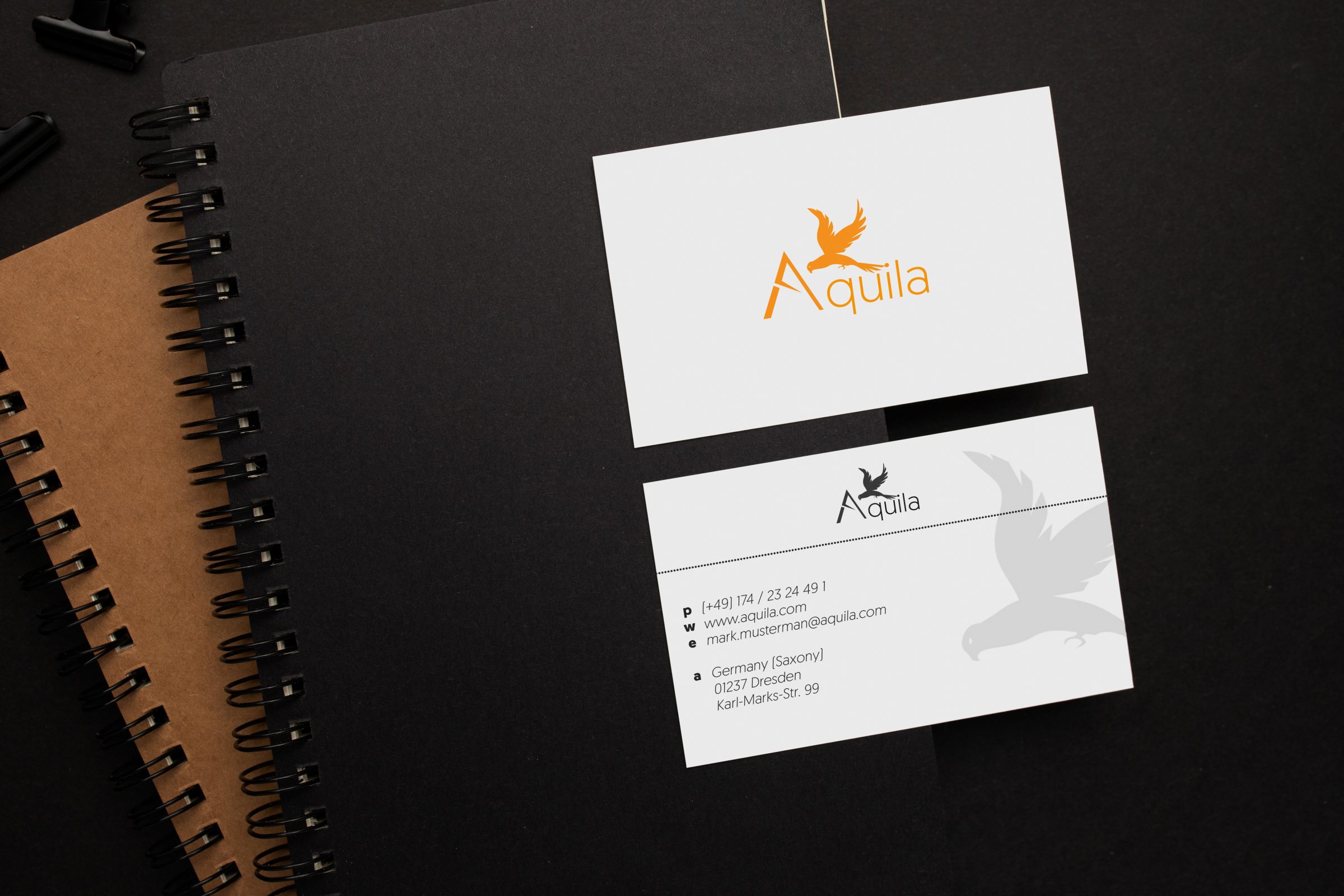
Aquila is a fashion label that embodies elegance, uniqueness, freedom, and stands for high quality. The logo refresh aims to reflect these values. With a clean, modern design and elegant form, the logo captures the essence of the brand. The stylized eagle symbolizes freedom and strength, while the flowing lines and harmonious typography emphasize Aquila's uniqueness and exclusivity. This logo is not just a symbol – it’s a statement for high-quality fashion accessible to everyone.


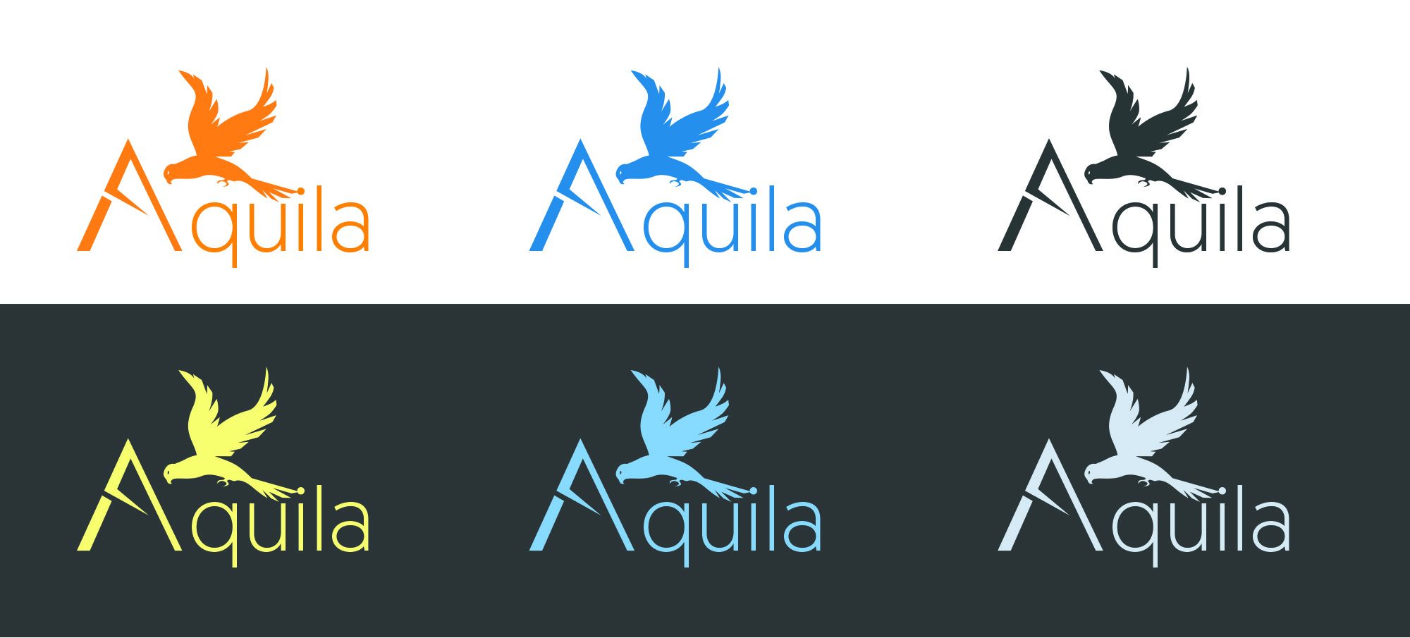
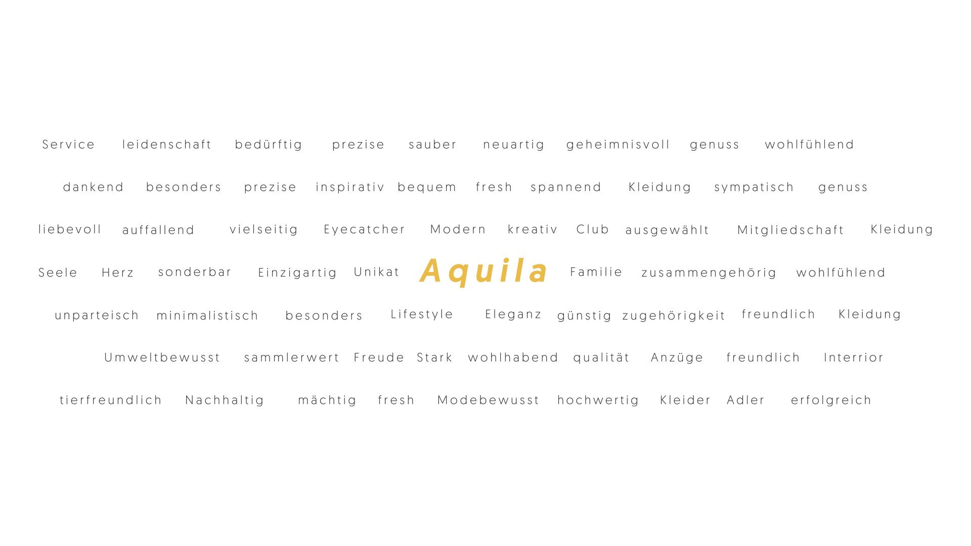
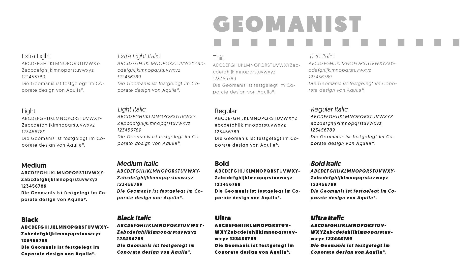

As a fashion brand, Aquila strives for professionalism and sets high standards in elegance, warmth, uniqueness, and individuality. The brand reflects these values not only through customer satisfaction and product quality but also in its strategic branding. The choice of the Geomanist font, with its precise design and variety of styles, perfectly captures the essence of Aquila. In contrast, the colors orange and blue symbolize extravagance and freedom. Delicate shades of gray, along with black and white, provide strong legibility and bring the elegance of the brand to the forefront.
More artworks on NEXETH.ART ↗